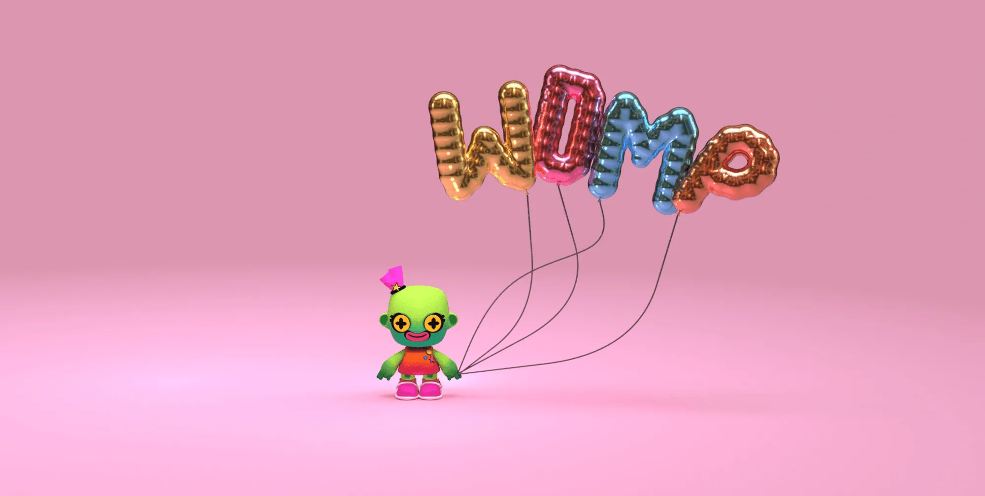
Hey there, design lovers! Are you ready to learn about the hottest trend in typography that's taking 2023 by storm? It's called chrome type, and it's all about giving your text a shiny, reflective finish that screams futuristic chic. In this blog, we'll delve into what chrome type is and why it's the must-have trend of the year. We'll also showcase some real-life brands that are embracing chrome type and giving their designs a high-tech edge. So, let's get started!
First things first: what exactly is chrome type?
As the name suggests, it's a type of typography that mimics the look of chrome - that is, a highly reflective, metallic surface. Think of the shiny logos on luxury cars, or the polished finish on high-end kitchen appliances. That's the look that chrome type is going for.
Chrome type can be created using various techniques, such as gradients, layer styles, and textures. The end result is a text that appears to be made of metal, with light reflecting off its surface in a way that catches the eye and gives the design a futuristic, high-tech vibe.
Chrome type has its roots in the early days of advertising and graphic design. In the early 20th century, designers began experimenting with metallic inks and finishes to create eye-catching designs that would stand out from the competition. Chrome type, which mimicked the look of polished metal, was a natural evolution of this trend.
One of the earliest examples of chrome type can be found in the work of art deco designers, who often incorporated sleek, streamlined typography into their designs. The chrome finish of the type added to the futuristic, industrial look of these designs, and helped to establish the chrome type as a symbol of modernity and progress.
In the mid-20th century, chrome type became even more popular as a design element, particularly in the automotive industry. Car manufacturers like Mercedes-Benz used chrome type on their logos and branding to emphasize the sleek, high-tech nature of their products. This trend continued throughout the 1950s and 60s, as chrome type became a ubiquitous part of American pop culture.
Today, chrome type continues to be a popular design element, although it has evolved in new and exciting ways. Thanks to advances in digital design tools, designers can now create chrome type effects that are more sophisticated and nuanced than ever before. From bold, mirrored finishes to subtle, brushed metal textures, there are countless variations of chrome type available to designers today and one can create it easily on tools like Womp.
As with any design trend, there are always new ways to experiment and push the boundaries of what's possible. In the coming years, we're likely to see even more innovation and creativity in the world of chrome type, as designers continue to explore the possibilities of this versatile and enduring design element.
Why is Chrome Type Trending in 2023?
There are a few reasons. For one thing, the futuristic aesthetic is very much in vogue, with many designers and brands looking to tap into the visual language of science fiction and technology. Chrome type fits perfectly into this aesthetic, giving designs a sleek, modern edge that's sure to grab attention.
Additionally, chrome type is highly versatile. It can be applied to a variety of design elements, from logos to packaging to web graphics. It can be used in a subtle way to add a touch of glamour to a design, or it can be used more prominently to create a bold, eye-catching effect. This flexibility makes it an appealing option for designers who want to experiment with different looks and styles.
How to Use Chrome Font in Your Designs?
There are various tools and techniques you can use, depending on your design software and skill level. Some popular options include using Photoshop or Illustrator to create a chrome effect using gradients and layer styles. If you are just getting started, you can explore design tools like Womp to create 3D chrome type - the super fun and playful materials on Womp will give the perfect chrome effect! The goopiness is what we love the most about Womp, don’t forget to give it a try.
And there you have it - everything you need to know about chrome type and why it's the trend to watch in 2023. From its shiny, futuristic aesthetic to its versatility and visual impact, there are plenty of reasons why designers and brands are embracing this trend. Whether you're a seasoned designer or just starting out, incorporating chrome type into your designs is a great way to stay on the cutting edge of design and catch the eye of your audience. Why not try your hand at creating your own chrome font and see where your creativity takes you!